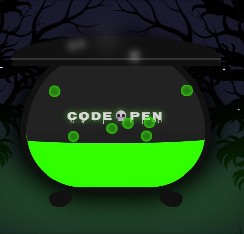
For a recent CodePen challenge, I had an idea: a spooky, bubbling cauldron, with swaying trees and wisps of steam. The catch? I wanted to do it with zero JavaScript.
Usually, when we want "organic" or "natural-feeling" motion, we reach for JavaScript. We might use a physics library or GSAP's gsap.quickTo() to create a smooth, swaying effect. But on the modern web, CSS has some powerful new tricks up its sleeve.
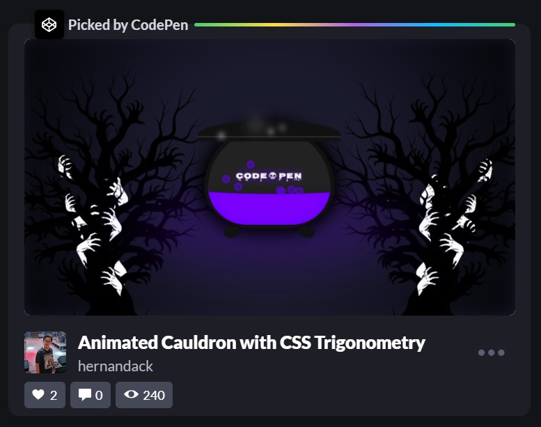
I ended up building the entire scene with pure CSS, and the community loved it—it even got "Trending Picked" by the CodePen team!
I wanted to break down the main "trick" behind it. It's a combination of two modern CSS features that, when paired, let you create incredibly complex animations:
- CSS
@property(The "Engine") - CSS Trigonometric Functions (
sin()andcos()) (The "Magic")
Part 1: The "Engine" - Understanding @property
Before we can do any magic, we need to understand @property. You can think of this as giving a "type" to a CSS variable.
Normally, if you try to animate a custom property, the browser doesn't know how. It just sees one value (like 0) instantly swap to another (360).
@property lets us tell the browser what our variable is.
@property --wobble-time {
  syntax: '<angle>';
  inherits: false;
  initial-value: 0deg;
}
By telling the browser that --wobble-time is an <angle>, we unlock a superpower. Now, when we animate it, the browser knows how to smoothly "tween" (or interpolate) from 0deg all the way to 360deg, frame by frame.
This is our engine. We can now create a simple, linear animation that just counts an angle from 0 to 360, over and over.
@keyframes wobble {
  to {
    --wobble-time: 360deg;
  }
}

/* We can apply this to any element */
.bubble {
  animation: wobble 1s infinite linear;
}
This animation itself doesn't do anything visual. It just endlessly counts --wobble-time up to 360deg. The real magic is how we use that changing number.
Part 2: The "Magic" - Using sin() for Organic Motion
This is the part that blows minds.
We have a variable (--wobble-time) that's smoothly animating from 0 to 360. How do we turn that linear "counting" into an organic "wobble"? With high-school math!
Remember the sin() function? It takes an angle and returns a value that smoothly oscillates between -1 and 1.
We can use this directly in our CSS transform:
.bubble {
  animation: wobble 1s infinite linear;

  /* This is the secret! */
  transform: translateX(calc(sin(var(--wobble-time)) * 20px));
}
Let's break that transform down:
var(--wobble-time)gives us the current angle (e.g., 45deg, 90deg, 180deg...).sin(...)takes that angle and returns a number between -1 and 1.* 20pxmultiplies that result.
As our animation counts from 0 to 360, our translateX is being told to move from 0px... to 20px... back to 0px... to -20px... and back to 0px. The result is a perfect, buttery-smooth horizontal wobble.
That's the entire trick. A simple, linear @keyframe animation combined with sin() gives us complex, organic motion.
Part 3: Stacking the Tricks
Once you understand that one core concept, you can apply it everywhere.
The Bubbles
The bubbles in the cauldron use two animations: one for rising, and our sin() wobble for the side-to-side motion.
.bubble {
  /* ... */
  animation:
    rise 3s infinite ease-in,
    /* This just moves it up */ wobble 1s infinite linear; /* This handles the --wobble-time */

  transform: translateY(var(--rise)) /* The 'rise' animation controls this */
    translateX(calc(sin(var(--wobble-time)) * 20px)); /* Our wobble! */
}

@keyframes rise {
  0% {
    --rise: 0%;
    opacity: 1;
  }
  100% {
    --rise: -600%;
    opacity: 0;
  }
}
The Swaying Trees
The haunted trees in the background? It's the exact same trick, just using rotate() instead of translateX().
@property --wind-time {
  syntax: '<angle>';
  inherits: false;
  initial-value: 0deg;
}

@keyframes sway {
  to {
    --wind-time: 360deg;
  }
}

.tree-left {
  animation: sway 12s infinite alternate ease-in-out;
  transform: rotate(calc(sin(var(--wind-time)) * 2deg));
}
Now, instead of wobbling left-to-right, the trees smoothly "sway" back and forth by 2 degrees.
The Cauldron Liquid
We can even combine sin() and cos() (which is just 90 degrees offset from sin()) to create a circular "sloshing" motion for the liquid's surface.
.cauldron-liquid::after {
  /* ... */
  animation: slosh 4s infinite linear;
  transform: translateY(calc(sin(var(--liquid-time)) * 3px))
    translateX(calc(cos(var(--liquid-time)) * 8px));
}
This gives us a more complex, less predictable movement that feels truly alive.
It's Not Magic, It's Just Math
It might look intimidating, but this whole animation is just a few simple concepts stacked together. By combining @property with sin()/cos(), we can create all sorts of "living" effects—swaying, wobbling, pulsing, or sloshing—all without a single line of JavaScript.
It's a powerful new addition to our CSS toolbelt and a perfect example of how the lines are blurring between what we thought was only possible with JS and what CSS can do on its own.
Check Out the Full Demo
I'll drop the full CodePen embed below so you can see all the pieces working together. (On my site, I'm using a simple embed component that just wraps an iframe to keep the markdown clean, but a standard embed works perfectly too!)