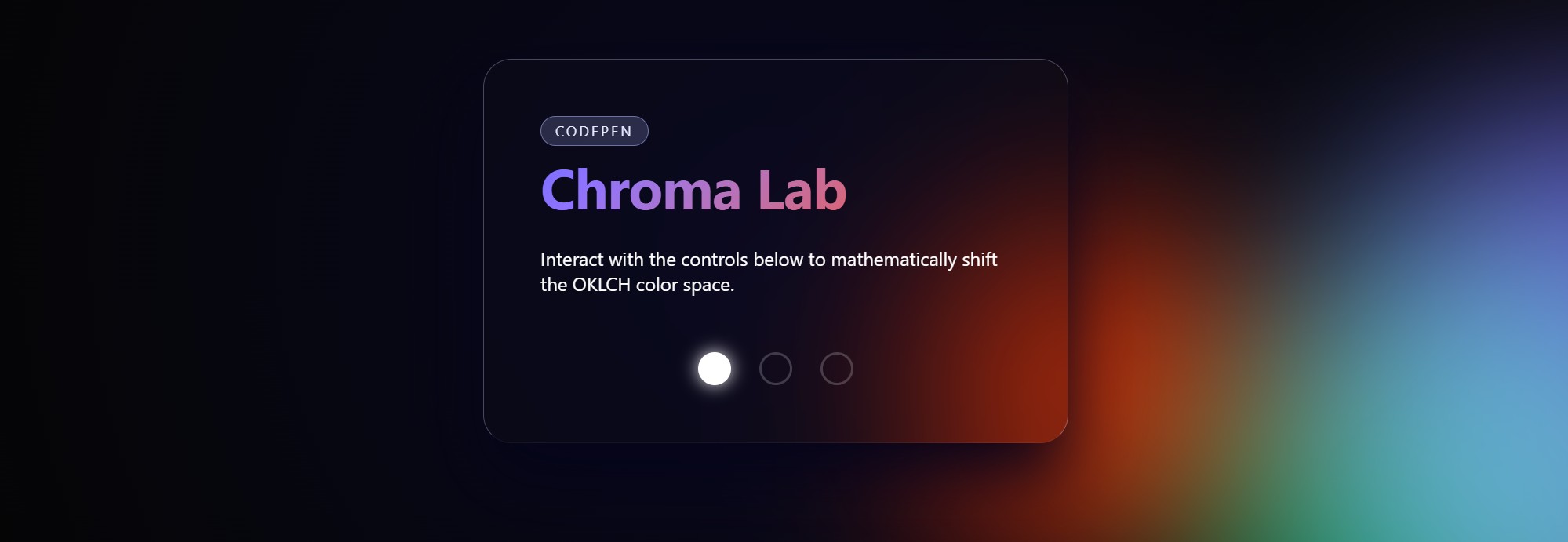
Back in February, I threw together a CodePen called "Chroma Lab" as an experiment. It’s an interactive, glowing, glassmorphism dashboard with floating orbs that change color themes when you click the controls.
It recently crossed 1,600 views and 60+ likes, and I’ve had a few developers ask me for the JavaScript source code.
Here's the fun part: There is zero JavaScript in this pen.
The entire thing—the state management, the smooth color transitions, the dynamic theming, and the organic orbital animations—is powered entirely by modern CSS.
Let's break down exactly how this works. I want to show you how you can use a combination of :has(), @property, oklch(), and CSS trigonometry (sin()/cos()) to build complex interactive components natively.
1. The Structure: The "Hidden Checkbox" Hack
To manage state without JavaScript, we need a way to store a "variable" in the HTML that CSS can read. We do this using the classic "hidden checkbox/radio" pattern, but supercharged with modern CSS.
Here is the core of our HTML:
<!-- 1. The State Storage (Hidden) -->
<input type="radio" name="vibe" id="vibe-cyber" checked hidden />
<input type="radio" name="vibe" id="vibe-ethereal" hidden />
<input type="radio" name="vibe" id="vibe-inferno" hidden />

<main class="art-board">
  <!-- ... visual elements ... -->

  <div class="controls">
    <!-- 2. The Triggers -->
    <label for="vibe-cyber" class="node" data-label="Cyber"></label>
    <label for="vibe-ethereal" class="node" data-label="Ethereal"></label>
    <label for="vibe-inferno" class="node" data-label="Inferno"></label>
  </div>
</main>
How it works:
The <input type="radio"> elements act as our application state. Because they share the same name="vibe", only one can be checked at a time. The <label> elements are connected to them via the for attribute. When you click a stylized label, it toggles the hidden radio button at the very top of the DOM.
2. The State Machine:
The Old Way: We'd write an event listener in JS to detect a click, figure out which theme was clicked, and append a class like .theme-cyber to the <body>.
The New Way: We use :has() to let the <body> spy on the radio buttons.
/* Map the radio buttons to a single master hue */
body:has(#vibe-cyber:checked) {
  --base-hue: 280; /* Purple/Blue */
}
body:has(#vibe-ethereal:checked) {
  --base-hue: 160; /* Teal/Green */
}
body:has(#vibe-inferno:checked) {
  --base-hue: 35; /* Orange/Red */
}
Read this as: "If the body :has() an element with the ID #vibe-cyber that is currently --base-hue to 280."
We just created a global state machine in 9 lines of CSS.
3. The Engine: @property for Smooth Transitions
If we stopped right here, clicking a button would instantly snap the colors from purple to green. We want a smooth, liquid transition.
But you can't normally transition a custom property like --base-hue because the browser just sees it as a meaningless string. We have to teach the browser what --base-hue is using @property.
@property --base-hue {
  syntax: '<number>';
  inherits: true;
  initial-value: 280;
}

body {
  /* Now the browser knows how to interpolate this number over 1 second! */
  transition: --base-hue 1s ease;
}
Now, when our :has() selector changes the hue from 280 to 160, the browser smoothly counts down the numbers in between.
4. The Paint: Relative Colors with OKLCH
This is where the magic really comes together. Instead of defining dozens of hex codes for every theme, we derive every single color in the UI from that one --base-hue variable using OKLCH.
OKLCH is incredible because it maintains consistent perceptual lightness. If you change the hue in HSL, your yellows will be blindingly bright and your blues will be incredibly dark. In OKLCH, lightness is perceptually uniform.
body {
  /* Define the base palette */
  --color-1: oklch(0.65 0.25 var(--base-hue));
  --color-2: oklch(
    0.65 0.25 calc(var(--base-hue) + 120)
  ); /* Analogous/Triadic shift */
  --color-3: oklch(0.65 0.25 calc(var(--base-hue) + 240));
}
Even better, we use Relative Color Syntax to build our glassmorphism UI. We can tell CSS: "Take --color-1, extract its channels, and spit out a slightly modified version."
.glass-prism {
  /* Take --color-1, keep its hue (h), but drop lightness to 0.2,
       chroma to 0.02, and set opacity to 15% */
  background: oklch(from var(--color-1) 0.2 0.02 h / 0.15);

  /* Create a subtle border based on the same hue */
  border: 1px solid oklch(from var(--color-1) 0.9 0.05 h / 0.3);
}
Because every color derives from --base-hue, and --base-hue transitions smoothly over 1 second, the entire UI smoothly cross-fades between themes automatically.
5. The Motion: CSS Trigonometry (sin() and cos())
Finally, we have the floating background orbs. We don't want them just bouncing up and down; we want them moving in organic, elliptical orbits.
By combining sin() and cos(), we can map out points on a circle natively in our keyframes.
@keyframes orbit {
  0% {
    /* Start at 0 degrees */
    transform: translate(calc(sin(0deg) * 20vw), calc(cos(0deg) * 20vh))
      scale(1);
  }
  33% {
    /* Move to 120 degrees, expand orbit path, scale up */
    transform: translate(calc(sin(120deg) * 25vw), calc(cos(120deg) * 15vh))
      scale(1.5);
  }
  66% {
    transform: translate(calc(sin(240deg) * 15vw), calc(cos(240deg) * 25vh))
      scale(0.8);
  }
  100% {
    /* Back to 360/0 degrees */
    transform: translate(calc(sin(360deg) * 20vw), calc(cos(360deg) * 20vh))
      scale(1);
  }
}

.orb-1 {
  animation: orbit 12s ease-in-out infinite alternate;
}
.orb-2 {
  animation: orbit 16s ease-in-out infinite alternate-reverse;
}
sin() dictates the X-axis motion, and cos() dictates the Y-axis motion. By messing with the multiplier (20vw vs 15vh), we turn a perfect circle into an offset ellipse. Applying this to multiple orbs with varying animation durations and directions creates a chaotic, lava-lamp-style effect.
The Big Picture
We've essentially built a functional dashboard without touching a <script> tag.
By passing our HTML state through :has() directly into an @property engine, and feeding that into dynamic oklch() color spaces, we allow the browser to do all the heavy lifting natively. It runs smoother, the code is entirely declarative, and it's wildly easier to maintain.
Check out the interactive embed below to see it all in action.